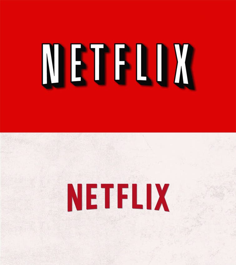
Netflix launches a new design in its desktop version and also a new logo that replaces the fantastic letters full of depth and black in the background that are reminiscent of the great Hollywood studios. No more.
Netflix is one of my favorite services, I can’t imagine life without that wonderful injection of magic that adds to my television being able to watch a ridiculous amount of movies and series whenever and however I want. The piercing red that fills the entire screen every time I launch the app on my Xbox is something that is already etched in my mind as the identity of Coca-Cola. The Netflix logo is iconic, and it has a lot of personality. Now they have apparently traded it for flat, lifeless letters for no apparent valid reason.
At FastCoDesign, Mark Wilson writes a rather interesting article about how boring the new logo is, and what little reason it has. An interesting read if this type of debate catches your attention.
The new and silly logo can be seen in the Netflix desktop application, another that has changed a lot to look even clearer and more minimalist. The player does keep the same design, with buttons filled with relief. Which does not make much sense if you are moving into the boring world where everything is flat, nothing has depth or relief, neither personality nor life.
The truth is that the trend of flat design is only becoming increasingly annoying and boring, and what more is less is more sometimes does not apply. Why change a perfectly good logo that is part of the identity of a brand for no apparent reason? Were they bored? Could this be a sign of something better? They should hurry to let Silverlight die and make a player that use real technology. It reminds me a bit of the case of the latest redesign of the Yahoo! logo, except that Yahoo! it had a terrible logo and they changed it to an equally bad one.
For now, the new design can only be seen from Netflix in the browser, and no application has been updated so far. Rest in peace the fabulous Netflix logo.


